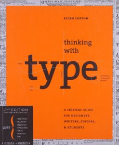
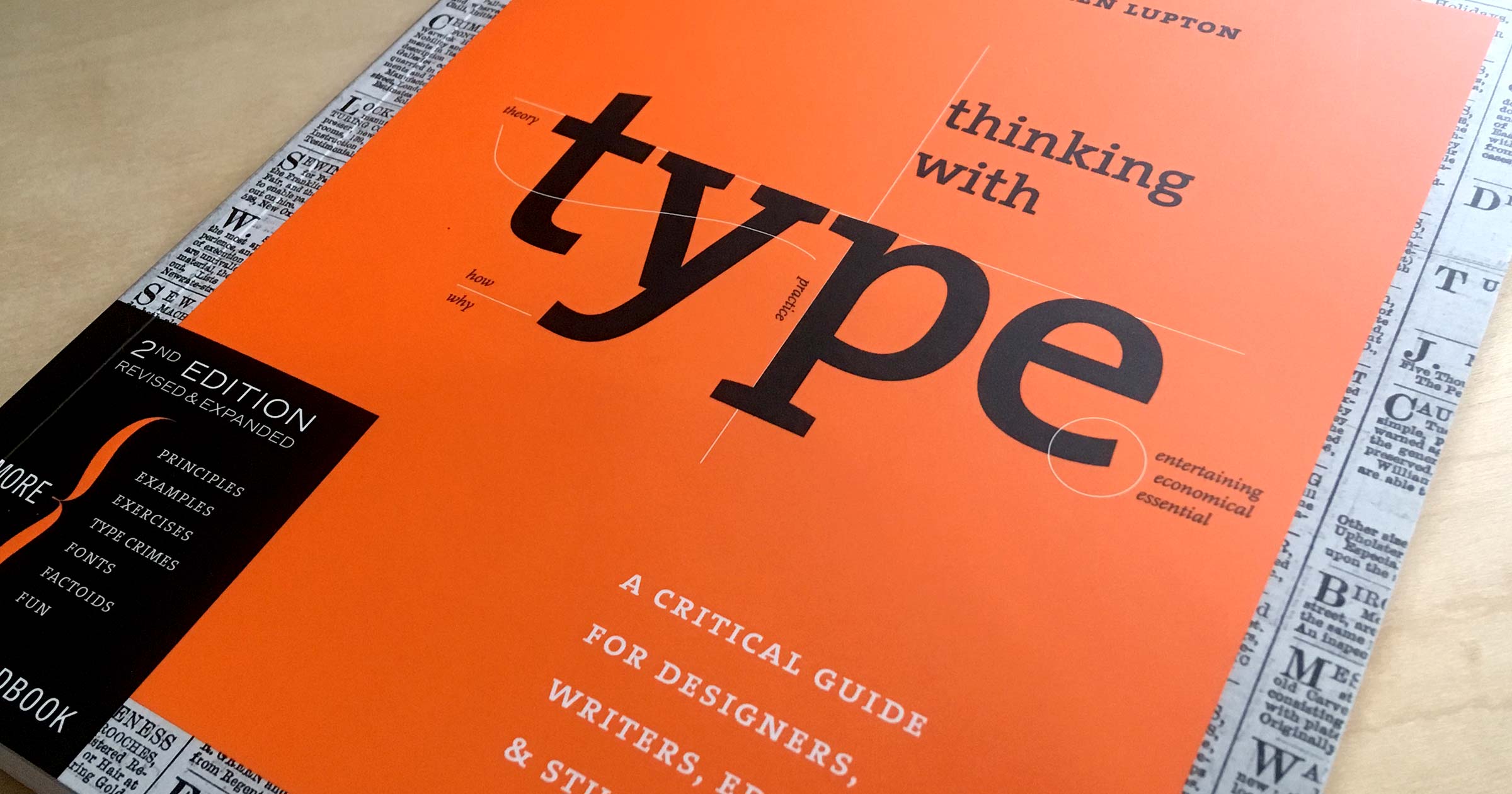
 For Christmas this past year, my wife gave me a copy of Thinking with Type: A Critical Guide for Designers, Writers, and Students (2nd revised and expanded edition) by Ellen Lupton. I just finished it and very much enjoyed reading it. I’ll definitely be using it as a reference.
These days, I generally prefer to read Kindle books on my Kindle Paperwhite, but this book is definitely better as a physical book.
Description
This is a great introduction to and reference on typography. It’s divided into three main sections—Letter, Text, Grid—plus an appendix.
Letter
Explains some of the history of letterforms and the printing process, explaining why certain aspects of typography are tied to mechanical processes. Goes into details about type families, punctuation, numeral styles, typefaces on screen, and more.
Text
Discusses legibility in the context of large blocks of text including kerning, tracking, alignment, and more.
Grid
Talks about page formatting, the golden ratio, and more specific details about laying out text on a page.
Appendix
Includes more details on proofreading, editing, and some free advice.
My Thoughts
Much of this information I was already familiar with, partly due to my dad working in the printing industry and teaching us some of the terminology and concepts. A number of the concepts have also been covered by various blog posts and other publications that I’ve read through my career.
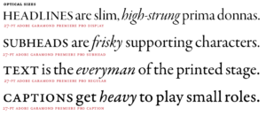
This guide includes examples on nearly every page (some created for the book and some from historical sources), either illustrating the point or depicting a “type crime” where type was mis-used.


You can read the description of the book on Amazon for more information or take a look at the companion website for exercises and some more details.

