responsive image markup

WordPress and Responsive Images: srcset and sizes Attributes

I’ve been puzzling over a performance issue on one of my sites lately and finally got it figured out today.

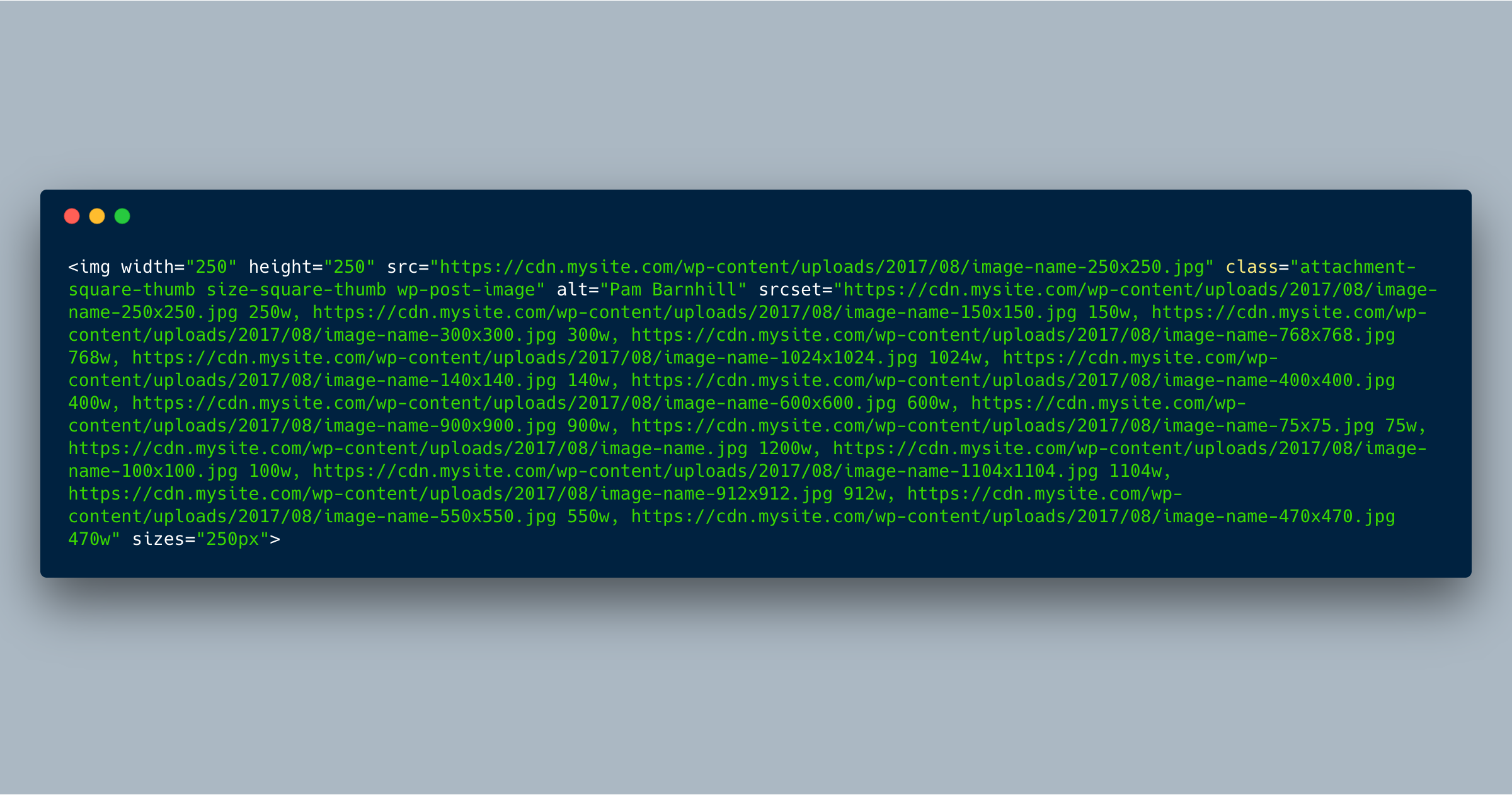
A custom shortcode uses the_post_thumbnail() to include a small image (~250px square); I have a bunch of custom image sizes set up, so the srcset attribute included 16 different image sizes. (Overkill? Maybe….) However, instead of using the image closest to 250px wide, Chrome was pulling in the largest available image—sometimes as much as 1500px! Obviously, this is terrible for performance.

In addition, certain pages had dozens of these images, multiplying the effect. My test-case page was 10+MB total (way too heavy…).

Here’s a sample <img> tag for one of my images:

<img
width="250"
height="250"
src="https://cdn.mysite.com/wp-content/uploads/2017/08/image-name-250x250.jpg"
class="attachment-square-thumb size-square-thumb wp-post-image"
alt="Image Name"
srcset="https://cdn.mysite.com/wp-content/uploads/2017/08/image-name-250x250.jpg 250w,
https://cdn.mysite.com/wp-content/uploads/2017/08/image-name-150x150.jpg 150w,
https://cdn.mysite.com/wp-content/uploads/2017/08/image-name-300x300.jpg 300w,
https://cdn.mysite.com/wp-content/uploads/2017/08/image-name-768x768.jpg 768w,
https://cdn.mysite.com/wp-content/uploads/2017/08/image-name-1024x1024.jpg 1024w,
https://cdn.mysite.com/wp-content/uploads/2017/08/image-name-140x140.jpg 140w,
https://cdn.mysite.com/wp-content/uploads/2017/08/image-name-400x400.jpg 400w,
https://cdn.mysite.com/wp-content/uploads/2017/08/image-name-600x600.jpg 600w,
https://cdn.mysite.com/wp-content/uploads/2017/08/image-name-900x900.jpg 900w,
https://cdn.mysite.com/wp-content/uploads/2017/08/image-name-75x75.jpg 75w,
https://cdn.mysite.com/wp-content/uploads/2017/08/image-name.jpg 1200w,
https://cdn.mysite.com/wp-content/uploads/2017/08/image-name-100x100.jpg 100w,
https://cdn.mysite.com/wp-content/uploads/2017/08/image-name-1104x1104.jpg 1104w,
https://cdn.mysite.com/wp-content/uploads/2017/08/image-name-912x912.jpg 912w,
https://cdn.mysite.com/wp-content/uploads/2017/08/image-name-550x550.jpg 550w,
https://cdn.mysite.com/wp-content/uploads/2017/08/image-name-470x470.jpg 470w"
sizes="250px"
/>

I finally realized that the root cause was that the sizes attribute was set to “100vw,” basically suggesting to the browser that the image might at some point be rendered at 100% width of the viewport, so my browser was happily pulling down the largest possible image so it could display it in all of its high-resolution, hundred-KB glory instead of the scaled dozen-KB file.

Since I know this particular shortcode will only show images at a max width of 250px, I needed to set the sizes attribute to “250px,” hinting to the browser that anything slightly larger than that would be perfectly adequate.

Here’s how I handled it:

  1. Added a filter to wp_get_attachment_image_attributes and checked for a named image size or array
  2. If it was an array, I set the sizes attribute to that pixel size
  3. If it was a named image size, I set the sizes attribute to that pixel size

Sample code:

<?php
/**
* Set sizes atribute for responsive images and better performance
* @param array $attr markup attributes
* @param object $attachment WP_Post image attachment post
* @param string|array $size named image size or array
* @return array markup attributes
*/
function armd_resp_img_sizes( $attr, $attachment, $size ) {
if ( is_array( $size ) ) {
$attr['sizes'] = $size[0] . 'px';
} elseif ( $size == 'thumbnail-no-crop') {
$attr['sizes'] = '140px';
} elseif ( $size == 'pinterest-thumb') {
$attr['sizes'] = '173px';
} elseif ( $size == 'pinterest-medium') {
$attr['sizes'] = '346px';
} elseif ( $size == 'square-tiny') {
$attr['sizes'] = '150px';
} elseif ( $size == 'square-thumb' ) {
$attr['sizes'] = '250px';
} elseif ( $size == 'square-small' ) {
$attr['sizes'] = '400px';
} elseif ( $size == 'square-medium' ) {
$attr['sizes'] = '600px';
} elseif ( $size == 'square-large' ) {
$attr['sizes'] = '900px';
} elseif ( $size == 'small-grid-size' ) {
$attr['sizes'] = '400px';
} elseif ( $size == 'small-grid-size-medium' ) {
$attr['sizes'] = '600px';
} elseif ( $size == 'small-grid-size-large' ) {
$attr['sizes'] = '800px';
}
return $attr;
}
add_filter( 'wp_get_attachment_image_attributes', 'armd_resp_img_sizes', 25, 3 );

This approach admittedly is a bit heavy-handed and I’m still testing out the behavior on other pages on the site, but this fixed the problem with that specific shortcode, and my test page went from 10+MB to ~5MB—it cut my page weight in half!

The moral of the story is don’t “set it and forget it,” especially when adding responsive images using custom code.

Thanks to VIA Studio for their blog post that finally made the solution click for me.

Leave a Reply

Your email address will not be published. Required fields are marked *

This site uses Akismet to reduce spam. Learn how your comment data is processed.